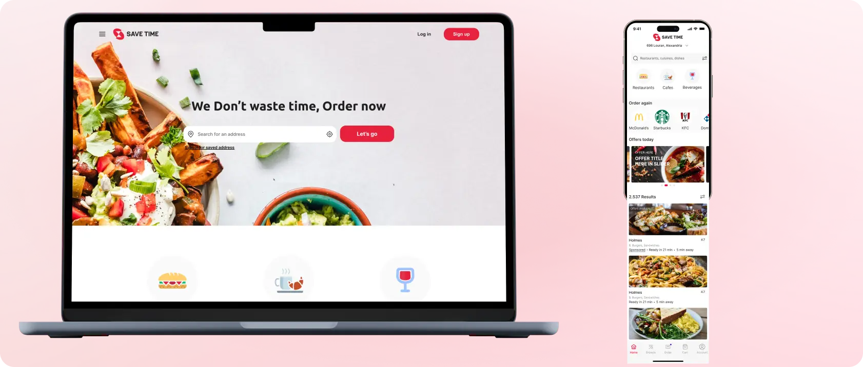
SaveTime is a user-friendly pick-up food app designed to streamline your dining experience. With a sleek interface, it allows users to browse nearby restaurants, place orders seamlessly, and conveniently pick up their favourite dishes without the hassle of waiting. SaveTime lives up to its name by optimizing the food-ordering process, making it quick, efficient, and, most importantly, saving valuable time for users on the go.
Role
Solo UI/UX Designer
Duration
5 weeks
Tools
Figma, Illustrator
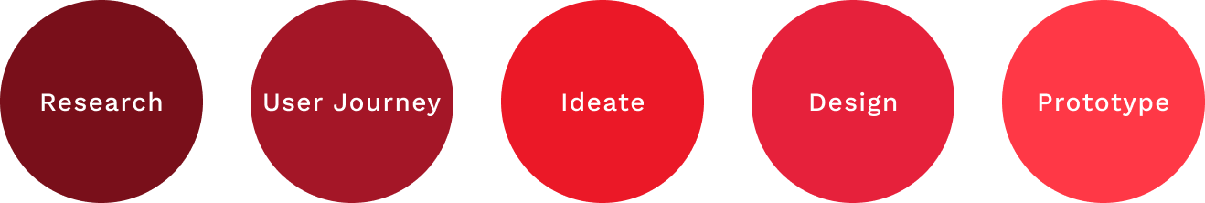
Design Process
In this project I focused on Task flow, sketching, prototyping, and testing.
Research
The Problem
Saving time is the most important thing in our modern age There is no time for standing in lines. We need an app that allows users to pick up the orders that they need online in their timeline. Saving spending a lot of time.
Project Goals
Today’s time is limited, people struggle to have free time to waste in lines. so we need an app that matches the following goals:
Efficiency: Streamline the food ordering and pick-up process to save users time and provide a hassle-free experience.
User Convenience: Prioritize user convenience by offering a user-friendly interface, intuitive navigation, and quick order placement.
Partnering with Local Businesses: Collaborate with a variety of local restaurants to provide users with a diverse range of dining options.
Order Customization: Allow users to easily customize their orders to cater to individual preferences, dietary restrictions, and special requests.
Notifications: Implement timely notifications to keep users informed about the status of their orders, estimated pick-up times, and promotions from their favourite restaurants.
Reliability: Ensure a reliable and secure platform, including robust payment processing and accurate order tracking, to build trust among users.
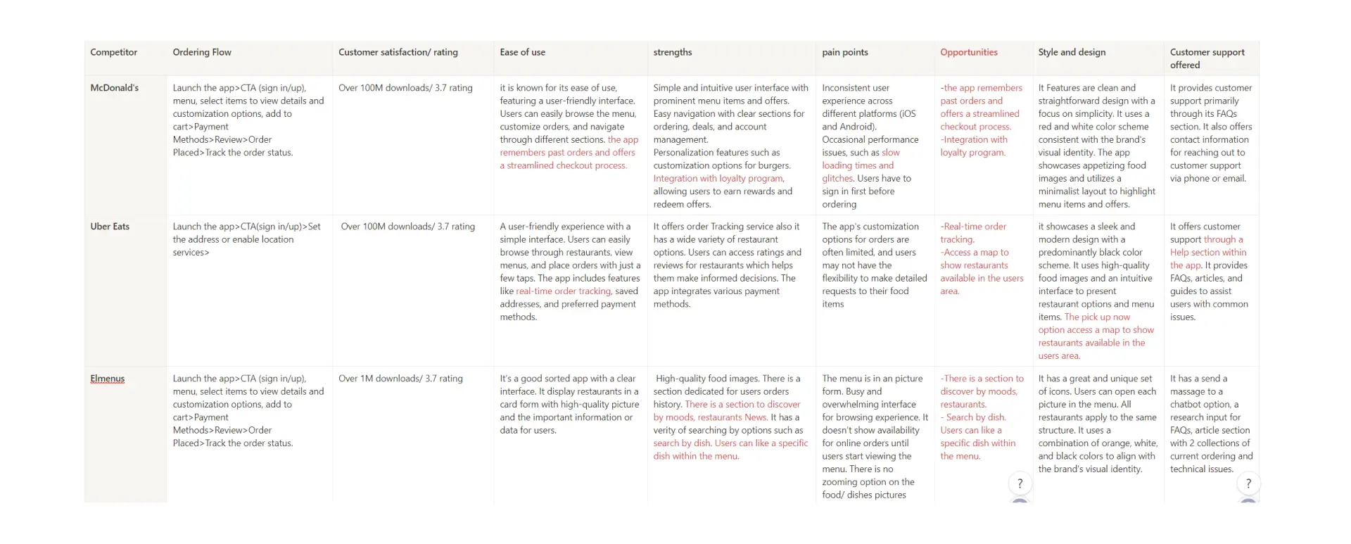
Competitive Analysis
I analysed competitors’ key objectives, marketing profiles, and overall strategy, and created both SWOT and UX analyses. I analysed three apps McDonald’s, UberEat, and Elmenue.
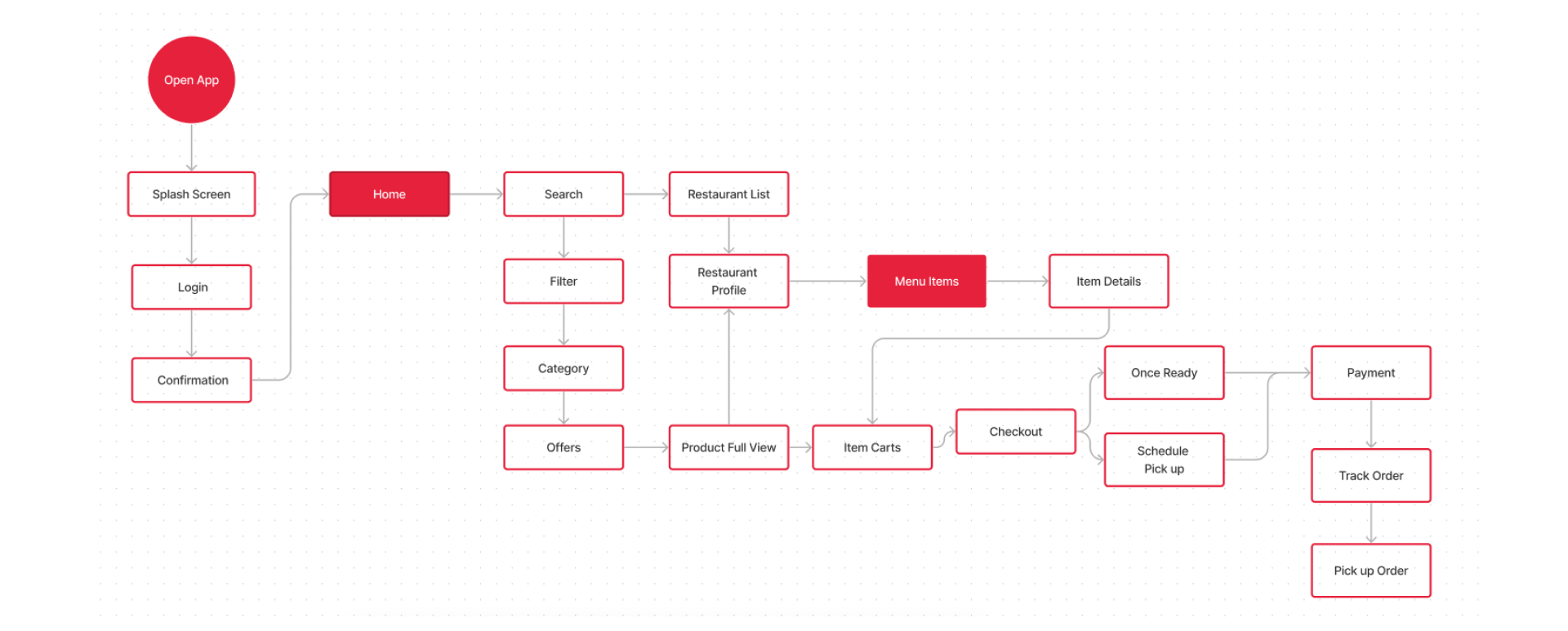
User Journey
User Flow
I created a user flow diagram to map out these features and see what kind of pages would be necessary for the app.
Design
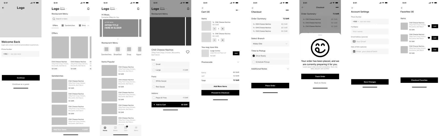
Sketches & Wireframes
I started sketching low-fidelity wireframes with pencil and paper. I moved on to Figma for my mid-fidelity wireframes.
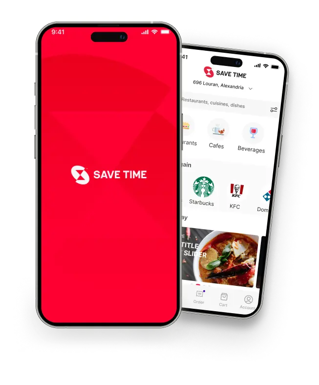
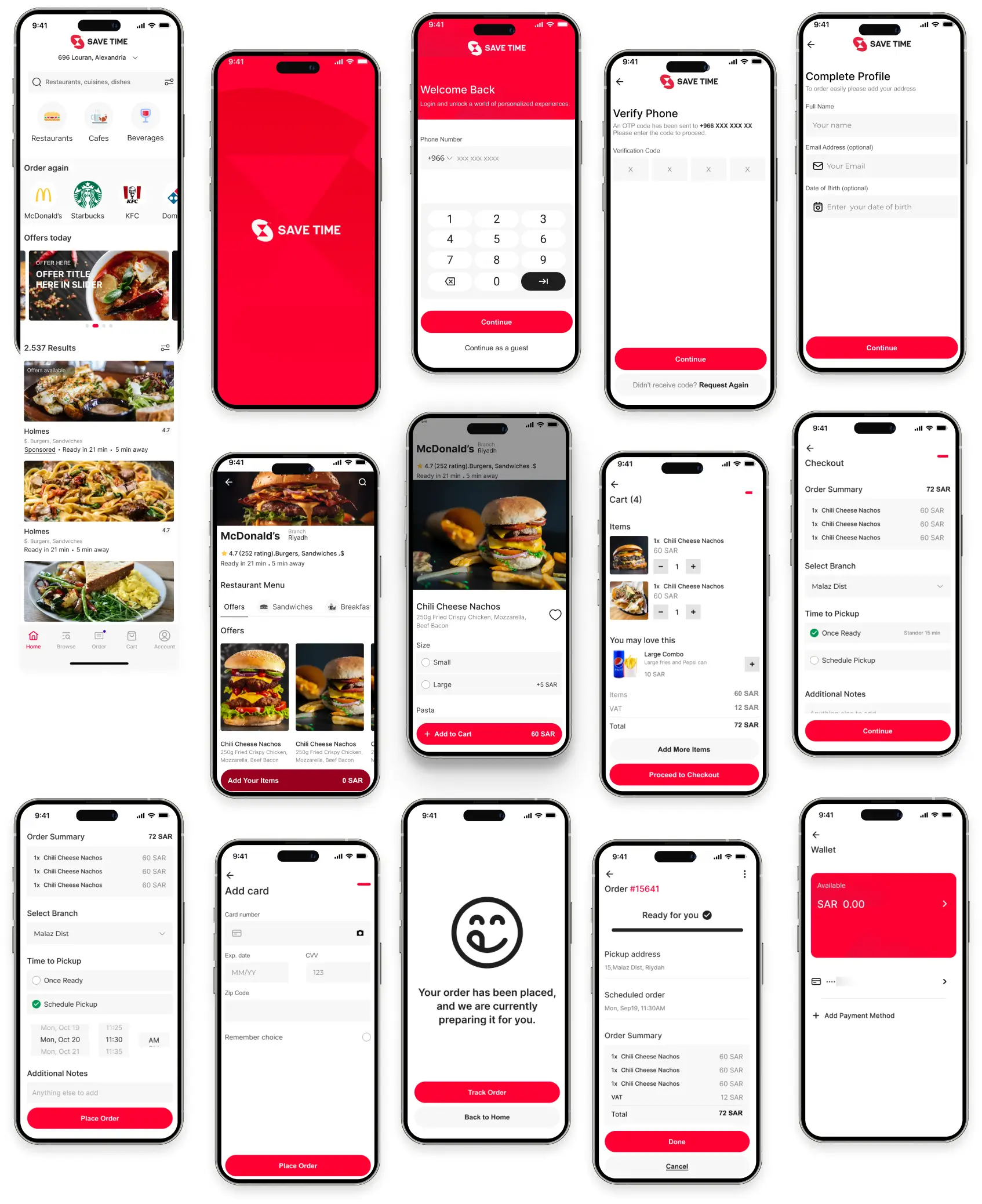
Mobile Application
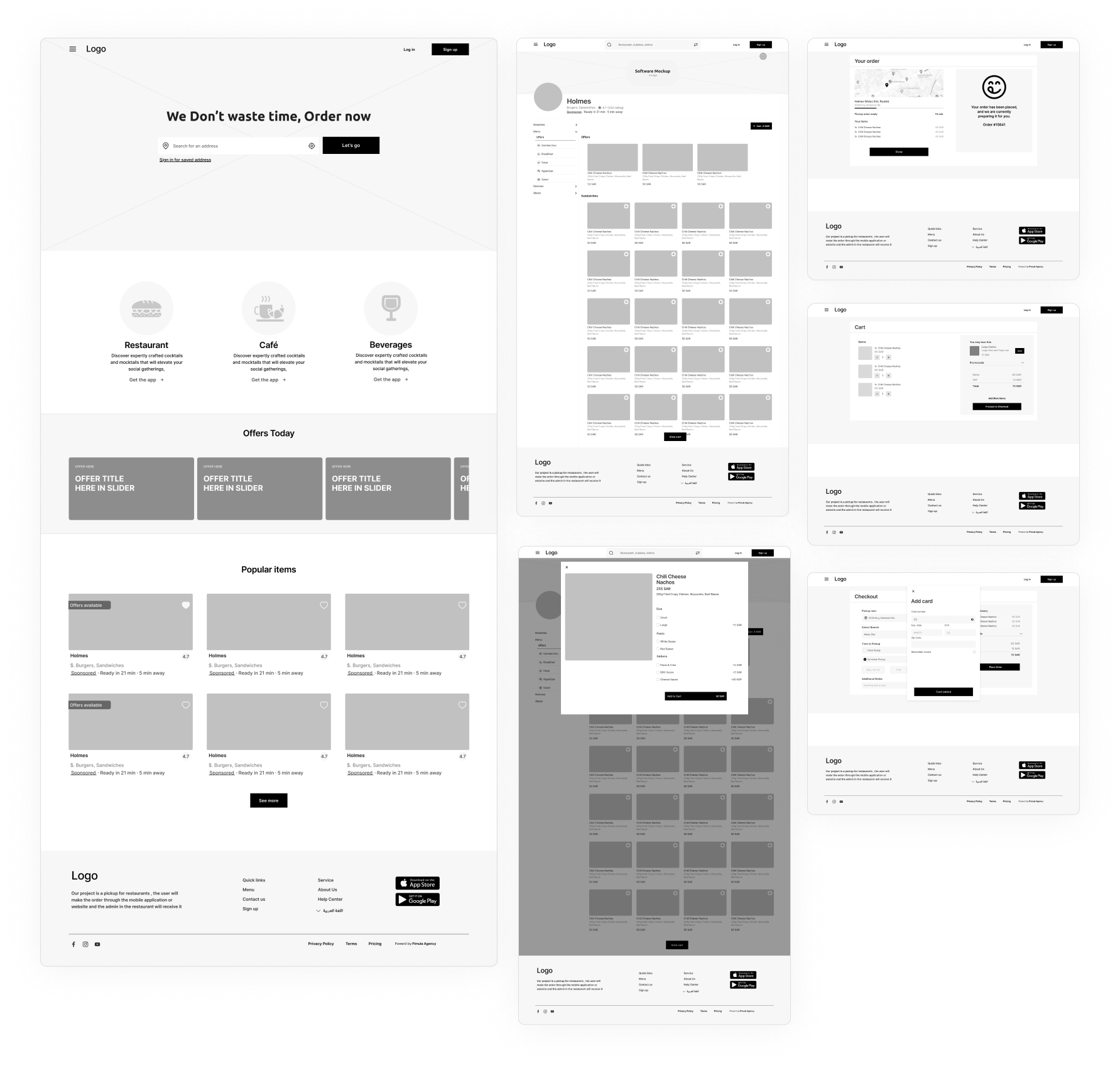
User Website
Mock ups
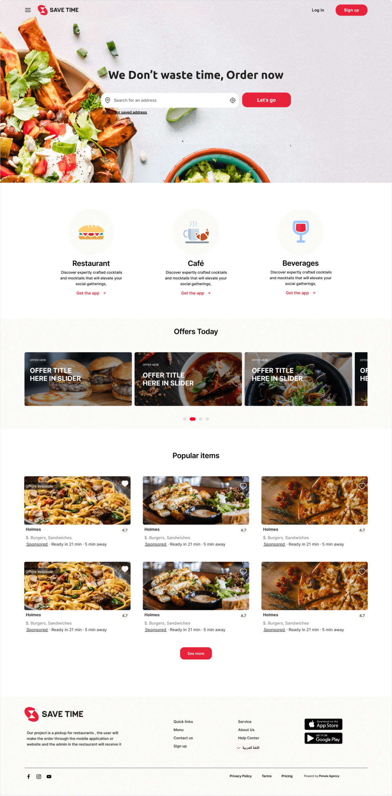
Website
Next Step
Testing and Learning
I would like to test the design with users to validate concept so far. It would be important to find out if the app’s flows and visual design resonate with users or not. I would also like to see where there are areas of improvement because continuous iterations are an integral part of the design process.